👋 Great designs start with great feedback. That’s what Workflow is built for. Start today.
Picking fonts is an incredibly challenging task. There are so many to choose from! Luckily, there’s a clear process that makes it a lot easier. Here’s how to choose fonts for your design projects.
- Updated on January 3, 2024
Table of Contents
The difference between headings and body fonts
There is a big difference between headings and body fonts. It is important to understand what these differences are before you go on to choose your fonts.
Heading fonts are about style. They usually are big letters that stand out on a website in terms of visual hierarchy and communicate the branding of a website or brand much more than body fonts.
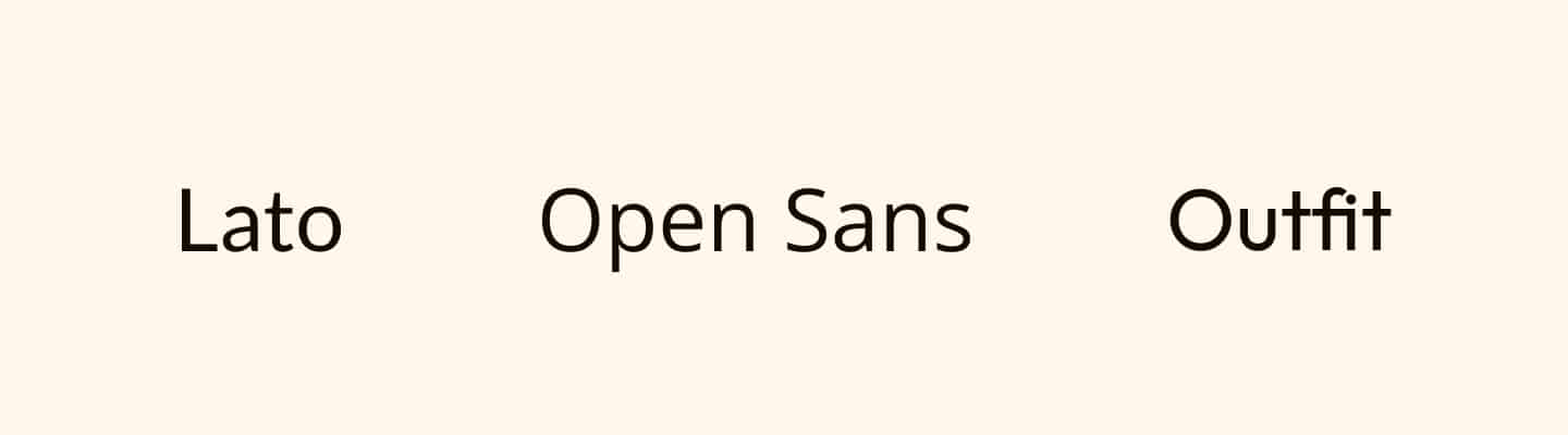
Lato, Open Sans, and Outfit are all valid choices if you’re looking for body text fonts. You can also use these as a heading font if you want a save option.
As a final tip, I want to mention that readability is about more than font choice. It’s a good first step, but font size and the colors you choose are just as important.
How to choose fonts for your design projects
Now that we know the difference between headings and body fonts, it’s time to move to the central portion of this article: choosing the fonts for your design project.
When choosing fonts, keep the following three principles in mind.
- Serif vs. sans-serif fonts.
- Font weight.
- Font roundness.
These principles are the same regardless of the kind of design project you’re working on.
Your project could be a website or an app, or something in print like a flyer or a book. That doesn’t really matter.
Choose between serif and sans-serif
The first thing that you have to do is understand and choose between a serif and sans-serif font.
The serif is that small line at the beginning and end of certain fonts.
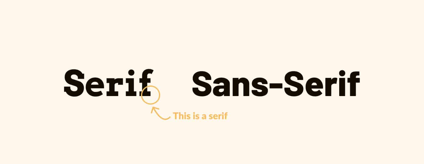
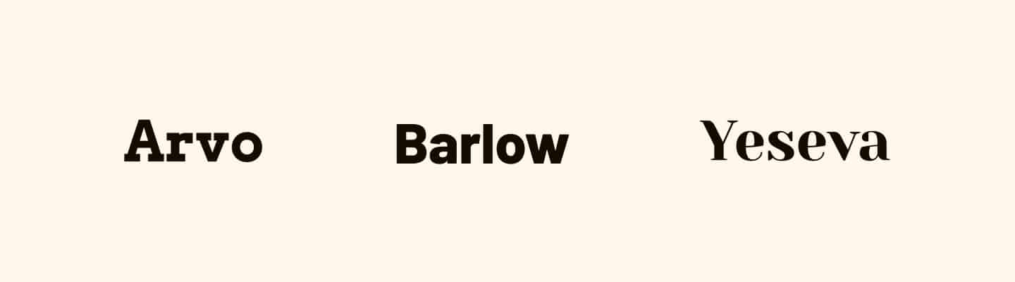
The main difference is that the serif font is usually considered more high-end or classy.
It looks old school and traditional, and if you have a website or design project for a bank or a luxurious clothing brand, choosing a serif font for your headings is usually the way to go.
On the other hand, sans-serif fonts are usually more informal and are better suited for playful design projects, like social media apps or startups.
When choosing heading and body fonts, you don’t have to select the same font type for both. You could pick a sans-serif body font while using a serif heading font. That’s completely fine.
Choose the font weight of your fonts
Up next is the thickness of a font, or as it is more commonly known; the font weight.
A heavier font usually is more informal, while a thin letter can be associated with class, luxuriousness, and minimalism.
If you choose a very thin sans-serif font, you could use that font for science fiction, a minimalistic design, or something futuristic.
Font roundness
The final principle to check before choosing your font is font roundness. Make sure it’s a good match for your other design element.
Let’s say you have round buttons and cards on your website. Choose a font that matches this style.
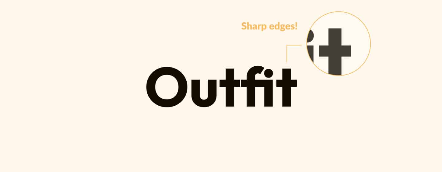
For example, if you pick Barlow, you can see that it has rounded edges. It would be much better suited than Outfit, which has very sharp edges.
That second option doesn’t work at all! So if you’re choosing a font for your design project, zoom in and check the roundness of the font and pick something that fits the rest of your design.
You can turn this principle around if you’re choosing a font at the start of your design project. In that case, design your elements based on the roundness of the font you’ve chosen.
An example from a real design project
Throughout my UX career, I’ve done multiple design projects where choosing a font was part of the project scope.
I want to share with you the steps I take, from not having a font to picking a font pair that’s very suitable for the project.
Align with your stakeholders
The first thing I always do when choosing a font is aligning with my stakeholders.
That means you have to ask several questions before you start your design project to discover things like scope and the general design direction you want to take the project towards.
Sometimes your stakeholders already have something for the fonts in mind.
Larger companies usually have a logo or brand guidelines to follow. It makes your job easier.
Smaller companies, on the other hand, usually have something in mind for their projects. This is arguably more challenging than picking fonts for a large company.
What I would do here is ask about preferences and examples that come close to what the stakeholders have in mind. This can result in something you can relate to the three principles discussed earlier.
Create several rounds of options to choose from
For one of my projects, I discovered my stakeholders were looking for a handwritten, calligraphy-style font.
That’s very helpful to know and a great starting point.
Next, I created a Figma file with several frames. I wrote the project’s name in each frame using several handwritten fonts.
Number each frame and send over the Figma file to your stakeholders for feedback.
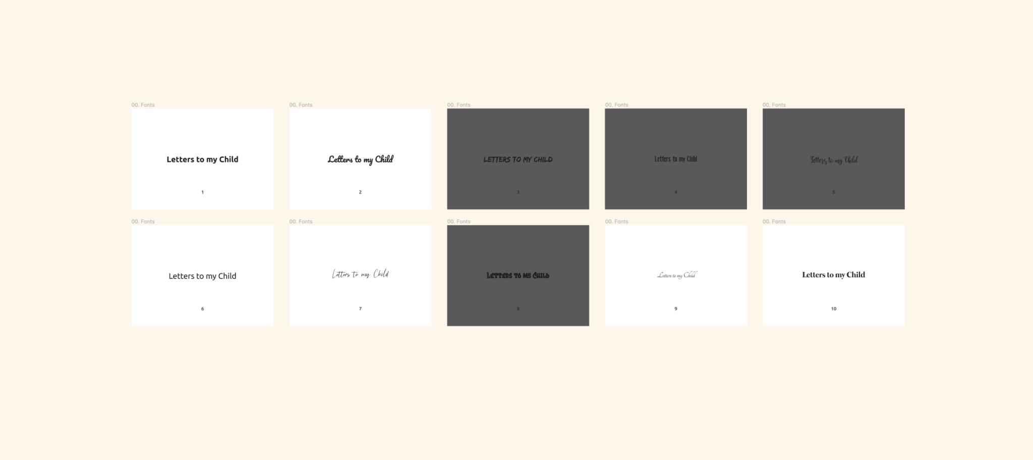
Look for generic feedback first by mentioning that the stakeholders can say ‘yes’ to all fonts but also ‘no’ to all fonts. Also, mention that it would be really helpful if they could provide feedback for frames that stand out.
The following quote is an example of the feedback that I got on one of the frames. It helps me narrow down the options.
I don’t like 3, 4, 5, and 8. It is a kind of “hmm, maybe” on 7.
I always do this for several rounds, bringing down the number of options from 10 in the first round to two or three in the final round before the stakeholders pick the final fonts.
And that’s it! You’ve picked fonts for your design project while involving your stakeholders. Well done!
Next steps
As for the next steps, now that you’ve decided what font pairs you want to choose, it’s time to continue with your design project.
That means picking colors to accompany the fonts and maybe a logo design to bring together the entire brand identity of your project.
If your work is more UI or UX based, a good next step would be to learn UX fundamentals, set up the layout and grid of your file, or move towards creating a prototype to test with your users.
👋 Turn good design to great design, with feedback you actually need. Get it on Workflow.

About the author
Hi! I'm Nick Groeneveld, a senior designer from the Netherlands with experience in UX, visual design, and research. I'm a UX coach that supports other designers and have completed design projects in finance, tech, and the public sector.
☎️ Book a 1:1 mentor meeting or let's connect on LinkedIn and Twitter.