Home - Design System - When to Use Radio Buttons and Checkboxes in UX
When to Use Radio Buttons and Checkboxes in UX
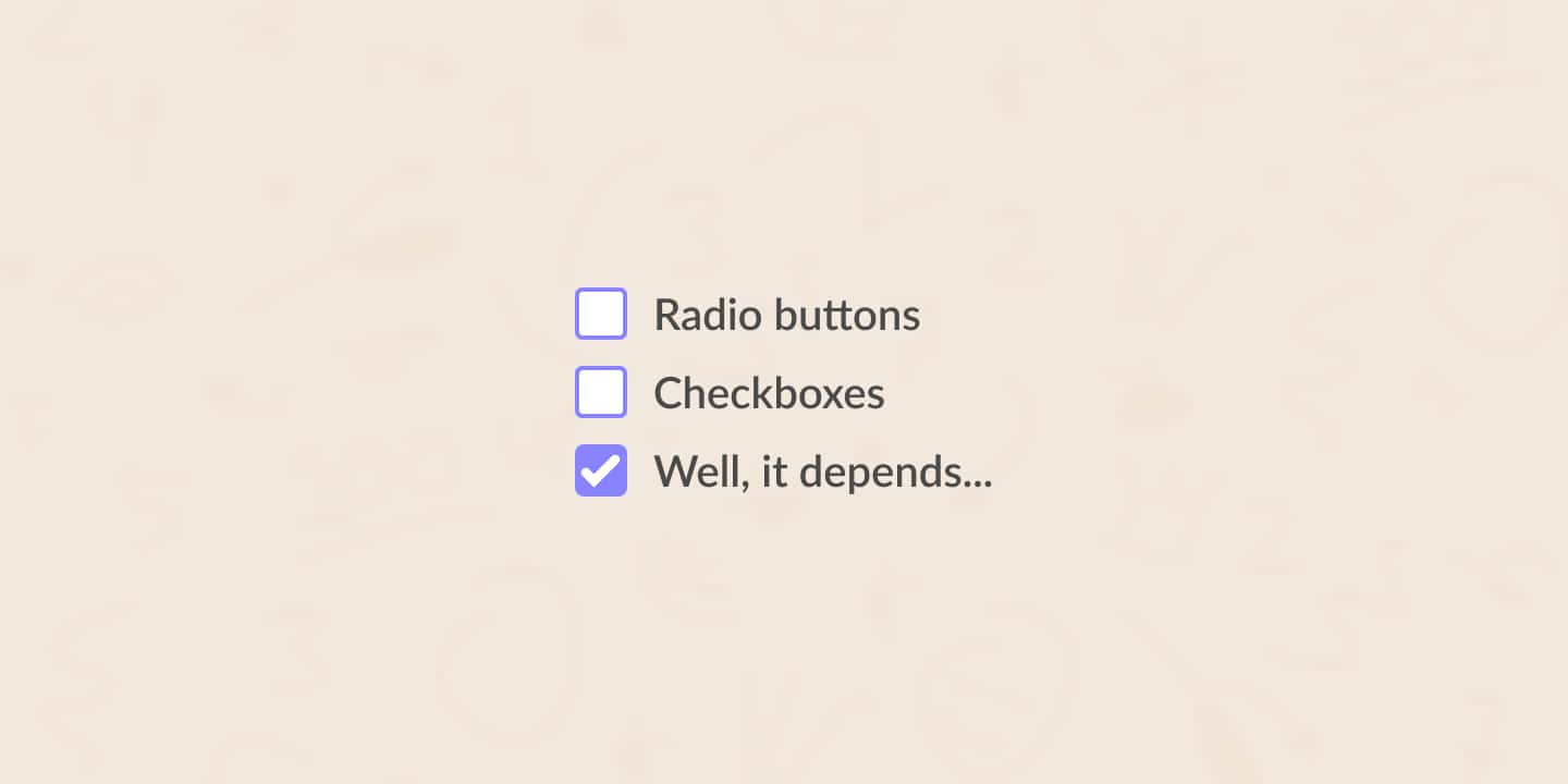
Radio buttons and checkboxes are common UI elements that we use a lot. As a result, there are a lot of UX guidelines on how and when to use these elements. In this post, I will take a closer look at when to use radio buttons and checkboxes in UX.
- Updated on August 14, 2022

Yet, there’s still a lot of confusion within the world of UI and UX design regarding when to use radio buttons and when to use checkboxes. Luckily, the theory is very clear. With some clarification, you can start using the right element in the right situation every time. Here’s how!
Table of Contents
In UX and UI design, you use radio buttons and checkboxes when users have to choose out of multiple options. As a UX designer, you choose between radio buttons and checkboxes based on the number of options your users are allowed to select at the same time.
The above is the theory. I will give some examples for radio buttons and checkboxes to clarify the UX and UI theory on both component types. Keep in mind that you use radio buttons and checkboxes to alter settings. You do not use them for active actions in your UI design.
What is a radio button?
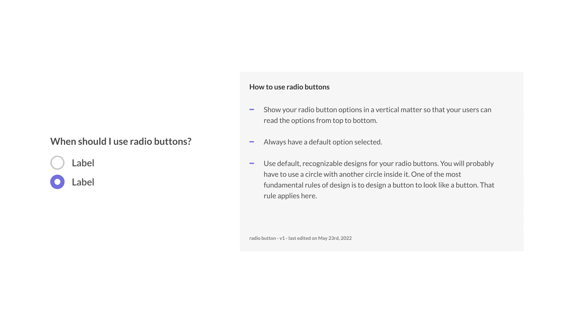
Radio buttons are circular buttons in a list of options where you can select exactly one option. The fact that you can choose one option is crucial here. Radio button options are mutually exclusive. Whenever you select a radio button with another one active, the previously active radio button will become inactive.

The history of radio buttons dates back to when the radio had physical buttons that you had to press to control the device. The visual representation of the radio button is a lovely example of the use of skeuomorphism in UX and how we design today.
When should I use radio buttons?
You use radio buttons when the user has to select one single option from a list of options. For example, the question could be a simple yes or no, a numeric list, a delivery date in a form, or anything similar.
From a UX and UI design standpoint, there are a few radio button guidelines you should keep in mind.
- Show your radio button options in a vertical matter so that your users can read the options from top to bottom.
- Always have a default option selected.
- Use default, recognizable designs for your radio buttons. You will probably have to use a circle with another circle inside it. One of the most fundamental rules of design is to design a button to look like a button. That rule applies here.
What is a checkbox?
Let’s take a look at checkboxes next. Checkboxes are square selection options most commonly used in a list of options. When you have a list of checkbox options, the user can select any of the checkboxes or none at all.
That is the main difference between checkboxes and radio buttons. Where you have to select exactly one option out of a list of radio buttons, you can choose anything ranging from zero to all options when you have to choose checkboxes.

In some UX and UI design cases, you can use a checkbox as a single option where the checkbox functions as a toggle switch. By (de)selecting the checkbox, the user selects ‘yes’ or ‘no’ for an option or setting.
When should I use checkboxes?
Just as with radio buttons, checkboxes have specific uses and moments when you shouldn’t use them. As stated previously, you use checkboxes when a user can select multiple options from a list. It includes selecting no options at all and selecting from a one-item list.
Some of the best practices regarding radio buttons apply here as well. Vertically show your checkboxes and use a default way of displaying your checkboxes.
Join the ultimate community-built design system

Radio buttons and checkboxes are part of the ultimate community-built design system. You can use the design system for any of your projects.
Also, I’m looking for designers to help grow and validate the design system. Check it on Gumroad.
Further reading
Radio buttons and checkboxes aren’t the only UI design elements with specific guidelines and best practices. I’m currently working on creating similar posts for tabs, infinite scrolling, and more. Check them out below.
Do you have feedback on this article? Missing something? Or just a question? Reach out to me and I’ll get back to you!

About the author
Hi! I'm Nick Groeneveld, a senior designer from the Netherlands with experience in UX, visual design, and research. I'm a UX coach that supports other designers and have completed design projects in finance, tech, and the public sector.
Through The Designer's Toolbox, I'm an Educational Partner for Interaction Design Foundation.
☎️ Book a 1:1 mentor meeting with me or let's connect on LinkedIn, Twitter and Medium.


