Table of Contents 💡
👋 Great designs start with great feedback. That’s what Workflow is built for. Start today.
Home - UX Design Tools - How much auto layout do designers need to use?
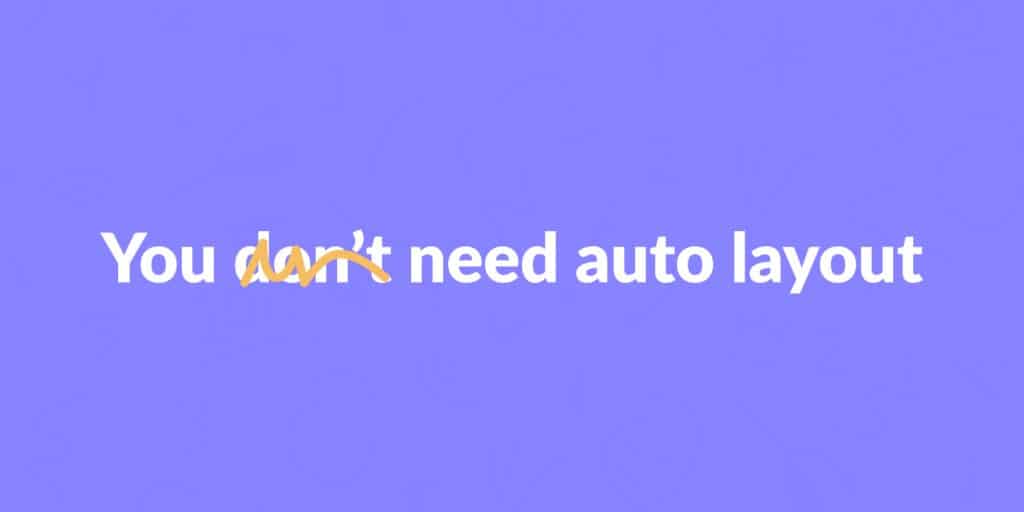
How much auto layout do designers need to use?
You have to use Figma’s auto layout. You’re a terrible designer if you don’t. That’s what several product designers within the design community say.
Some designers claim the opposite, too. They say there’s no need to use auto layout at all because it hurts creativity.
- Updated on October 21, 2024
But which one is true? Should or shouldn’t UX and product designers use auto layout?
Here’s my much more nuanced take based on my ten years of experience working on real (product) design projects.
Table of Contents
Should UX and product designers use auto layout?
As a designer in Figma, you should always use at least the fundamentals of auto layout. It saves you lots of time without loss of creative freedom.
How much more you use beyond the fundamentals depends on your project’s stage in the design process.
- If you’re in the early stages of a project where you figure out the overall customer journey and important user flows, you only need a minimum amount of auto layout.
- If you have the big picture set up and are mainly working on ‘producing pixels,’ using auto layout as much as possible will save you a lot of time.
By the way, in the video below, we go into more detail about the above and how it works for UX projects in practice. Take a look!
The amount of auto layout to use
As you can see, using auto layout isn’t a matter of ‘yes or no,’ but rather ‘how much.’ It depends on how likely you’re going to need to make changes.
It is far more likely you have to make changes in the early stages of a project. For some pages and components, auto layout makes it more challenging to apply challenges.
Here’s what to use. I’ve sorted this list based on how well it can handle changes. The first one’s super easy to change.
Buttons
Using auto layout for buttons is an excellent place to start. Select a text layer and click ‘add auto layout’ from the right-click menu. You can add a background color, stroke, and border radius (optional).

While you’re at it, create a component for this button, too. It’ll save you more time.
What is a component in Figma?
In Figma, a component is a reusable bit of design. In this example, we’re talking about a button. You can use a component in multiple places.
When you change the main component, it’ll update all the instances automatically.
Input fields
There’s not a lot of creativity or risk in designing input fields, which means it is perfectly fine to use auto layout here.
In this case, only selecting the text layer to create the auto layout (as we did with buttons) doesn’t work. That’s because input fields vary, like password fields, dropdown menus, and regular text fields.
Instead, create a text layer and add an icon to the right. Select both and add the auto layout. You can also set the background color, stroke, and border radius here.
You can now drag and drop to rearrange the order of your input field. This is very useful when changing between a dropdown menu (icon to the right) and a search field (icon to the left).

Forms
If you put together the input fields and a submit button from the list above, you can also use auto layout to save time when designing forms.
The only challenge here is that designers (and their stakeholders) have some decisions to make, like what to ask and the number of questions per page within a form.
This could mean a lot of custom work and iterations before you find the proper form. In that case, auto layout may slow you down instead of speeding up your work.
When you do decide to go with auto layout, select your input fields and buttons, select ‘add auto layout,’ and set the margin between the fields. Done!
Header and footer
The final items on our auto layout list are the header and footer. Just as with the buttons, turning this into a component is a smart move, too.
Use auto layout for the header to create equal spacing between the menu items. The outside padding is something you can set, too.
As for the footer, you usually have two or three columns where auto layout makes sense. Within each column, you can use a nested auto layout the same way as you use it to create forms. This helps with footer menus, for example.
Next steps
Whether or not you should use auto layout in Figma is a hot topic within the UX and product design community. I’ve always felt that this discussion gets too much attention. It is just a design tool.
Instead, only use auto layout as much as makes sense. In this article, you can read how that works. You can also learn more about Figma’s auto layout in our course.
As for next steps, I suggest working on your portfolio, where you can highlight your business results working as a designer and how Figma (and auto layout, perhaps) has helped you achieve those results.
👋 Turn good design to great design, with feedback you actually need. Get it on Workflow.

About the author
Hi! I'm Nick Groeneveld, a senior designer from the Netherlands with experience in UX, visual design, and research. I'm a UX coach that supports other designers and have completed design projects in finance, tech, and the public sector.
☎️ Book a 1:1 mentor meeting or let's connect on LinkedIn and Twitter.
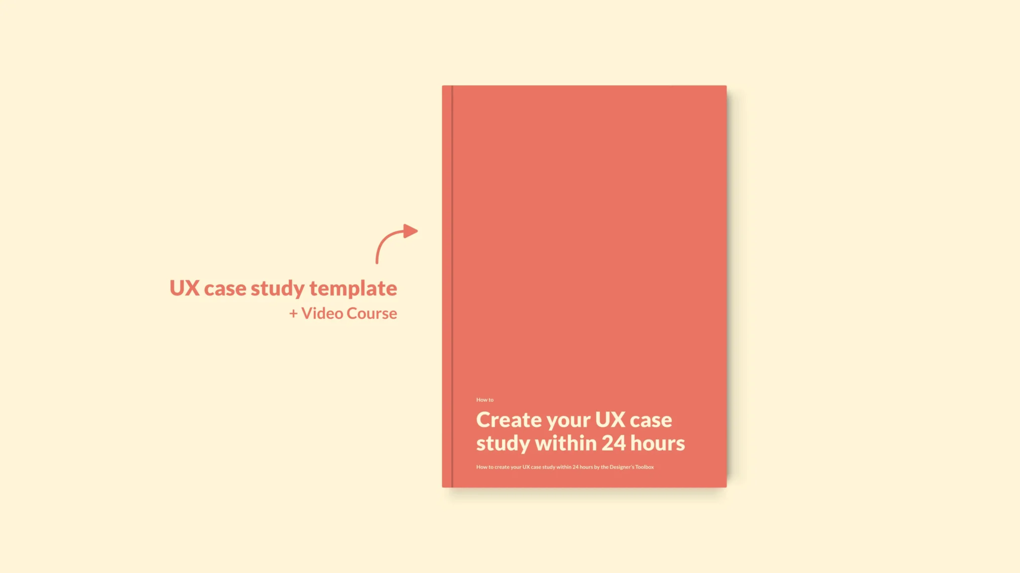
(Course) Learn how to create a UX case study within a day